
渐变属性
linear-gradient 线性渐变repeating-linear-gradient 重复线性渐变radial-gradient 径向渐变repeating-radial-gradient 重复径向渐变实例
线性渐变背景色 to bottom / 蓝 / 粉<style>.boxContent {width: 400px;height: 200px;margin: 20px;padding: 20px 0;box-sizing: border-box;text-align: center;}.boxContent.box1 {background: linear-gradient(to bottom, rgb(107, 175, 240), rgb(245, 137, 227));}</style>
线性渐变背景色 to bottom right / 蓝 / 粉
<style>.boxContent {width: 400px;height: 200px;margin: 20px;padding: 20px 0;box-sizing: border-box;text-align: center;}.boxContent.box2 {background: linear-gradient(to bottom right, rgb(107, 175, 240), rgb(245, 137, 227));}</style>
线性渐变背景色 -30deg / 蓝 / 粉
<style>.boxContent {width: 400px;height: 200px;margin: 20px;padding: 20px 0;box-sizing: border-box;text-align: center;}.boxContent.box3 {background: linear-gradient(-30deg, rgb(107, 175, 240), rgb(245, 137, 227));}</style>
线性渐变背景色 to bottom / 蓝 10% / 粉
<style>.boxContent {width: 400px;height: 200px;margin: 20px;padding: 20px 0;box-sizing: border-box;text-align: center;}.boxContent.box4 {background: linear-gradient(to bottom, rgb(107, 175, 240) 10%, rgb(245, 137, 227));}</style>
线性渐变背景色 to bottom / 蓝 10% / 粉 60%
<style>.boxContent {width: 400px;height: 200px;margin: 20px;padding: 20px 0;box-sizing: border-box;text-align: center;}.boxContent.box5 {background: linear-gradient(to bottom, rgb(107, 175, 240) 10%, rgb(245, 137, 227) 60%);}</style>
线性渐变背景色 to bottom / 蓝 半透明 / 粉 不透明
<style>.boxContent {width: 400px;height: 200px;margin: 20px;padding: 20px 0;box-sizing: border-box;text-align: center;}.boxContent.box6 {background: linear-gradient(to bottom, rgba(107, 175, 240, 0.5), rgba(245, 137, 227, 1));}</style>
线性渐变重复背景色 to right / 白 0% / 蓝40% / 粉50%默认第一个颜色起始是0,最后一个颜色的百分比为终止位置如果最后一个颜色百分比为 20%,则图形中会出现 5 组渐变色
<style>.boxContent {width: 400px;height: 200px;margin: 20px;padding: 20px 0;box-sizing: border-box;text-align: center;}.boxContent.box7 {background: repeating-linear-gradient(to right, rgb(255, 255, 255), rgb(107, 175, 240) 40%, rgb(245, 137, 227) 50%);}</style>
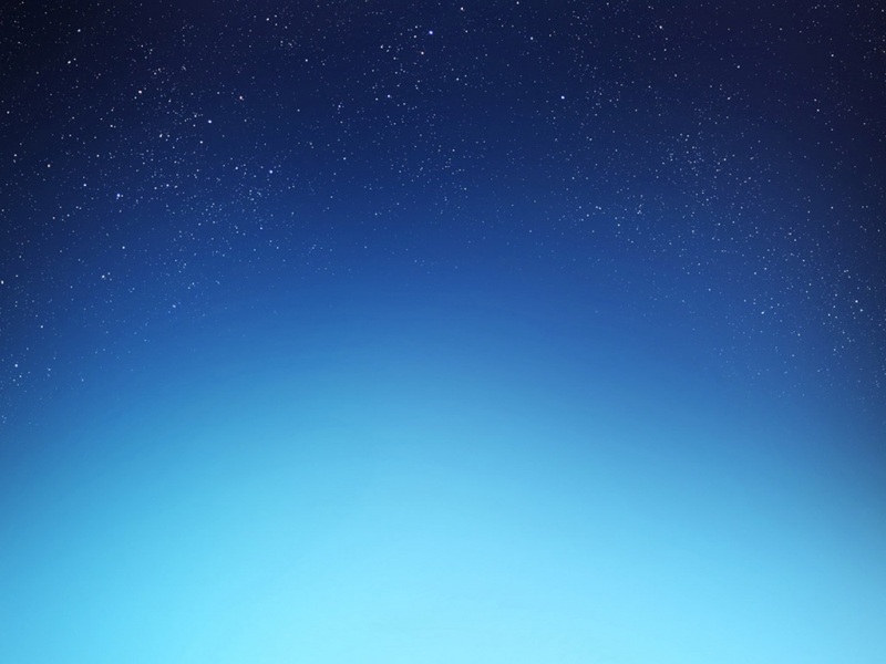
径向渐变背景色 默认形状(椭圆) / 蓝 / 粉
<style>.boxContent {width: 400px;height: 200px;margin: 20px;padding: 20px 0;box-sizing: border-box;text-align: center;}.boxContent.box8 {background: radial-gradient(rgb(107, 175, 240), rgb(245, 137, 227));}</style>
径向渐变背景色 圆形 / 蓝 / 粉径向渐变其他属性,repeat、百分比等特性都与线性渐变一样
<style>.boxContent {width: 400px;height: 200px;margin: 20px;padding: 20px 0;box-sizing: border-box;text-align: center;}.boxContent.box9 {background: radial-gradient(circle, rgb(107, 175, 240), rgb(245, 137, 227));}</style>
字体渐变 div 添加渐变效果,字体透明镂空,形成字体颜色渐变的效果
<style>.boxContent {width: 400px;height: 200px;margin: 20px;padding: 20px 0;box-sizing: border-box;text-align: center;}.boxContent.box10 {background: linear-gradient(to bottom, rgb(107, 175, 240), rgb(245, 137, 227));-webkit-background-clip: text;-webkit-text-fill-color: transparent;font-weight: bold;font-size: 80px;}</style>