
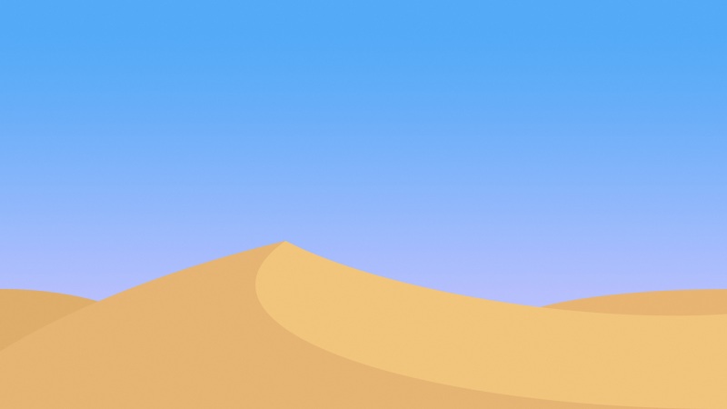
很多网站是全背景图片的,而且适应各种主流分辨率,给人一种干净大气的感觉,实属设计派的一个耍酷良方,下面介绍几种实现全屏图片自适应缩放背景图片的方法。
1.帅气简单的CSS3方法
html {background: url(images/bg.jpg) no-repeat center center fixed;-webkit-background-size: cover;-moz-background-size: cover;-o-background-size: cover;background-size: cover;}
Safari 3+Chrome Whatever+IE 9+Opera 10+Firefox 3.6+
2.只使用CSS之方法一
img.bg {min-height: 100%;min-width: 1024px;width: 100%;height: auto;position: fixed;top: 0;left: 0;}@media screen and (max-width: 1024px) {img.bg {left: 50%;margin-left: -512px;}}
以下浏览器的任何版本: Safari / Chrome / Opera / FirefoxIE 6: (各种方案奈我何?!)IE 7/8: 大部分工作,小屏幕的时候全屏,但是不是居中IE 9: 没问题
3.只使用CSS之方法二
#bg {position:fixed;top:-50%;left:-50%;width:200%;height:200%;}#bg img {position:absolute;top:0;left:0;right:0;bottom:0;margin:auto;min-width:50%;min-height:50%;}
Safari / Chrome / FirefoxIE 8+Opera
4.jQuery方法
#bg { position: fixed; top: 0; left: 0; }.bgwidth { width: 100%; }.bgheight { height: 100%; }
$(window).load(function() {var theWindow = $(window),$bg = $("#bg"),aspectRatio = $bg.width()/$bg.height();function resizeBg() {if ( (theWindow.width()/theWindow.height()) $bg.removeClass().addClass('bgheight');}else{$bg.removeClass().addClass('bgwidth');}}theWindow.resize(function() {resizeBg();}).trigger("resize");});
IE7+任何除了IE的浏览器的任何版本
转载自:网站大背景(按比例缩放背景图片)